Share this
Basic Guide to Brand Design
by Jin on Nov 10, 2022 8:30:00 AM
Contents
- The Importance of Brand Designing
- The Message the Brand is Trying to Convey
- Mood Board, A Compass of Design Direction
- Color Scheme for Brand Color
- 2022 Color Trend
In an era where capitalism-based consumer culture is established, brand design is steadily developing. If we have customers, of course, the market will not disappear, and the various brands on the market will stand out and try hard to satisfy them. So what do we need to know for eye-catching brand designs?
1. Importance of Brand Designing
When you think of brand design, you can come up with ‘Logo Design’. But it's just thinking about a narrow domain of brand design. Brand design refers to the development of a graphic that can express the brand's philosophy or message at the point where the brand meets the customer. By visually demonstrating brand identity to make everything related to the brand make customers feel positive.
Not just logos, but posters, business cards, leaflets, spaces, uniforms, and interiors, all of which make customers aware of the brand are included in the brand design. All of these have to convey the brand's philosophy and message with one identity and unity. So, when you start designing a brand, you need to go beyond just applying the logo to the mockups and figure out how to show the brand in other applications, such as posters and leaflets.
2. The Message the Brand is Trying to Convey
Before designing a brand, you must maintain consistency in the message that the brand is trying to convey to the customer. In other words, from the planning stage, you have to decide what brand message to include.
 Source: BAEMIN
‘Baemin Live’ is music content regularly published by Baemin. Why does the delivery food service create music content? Baemin has an ambition beyond just a brand that delivers food to create a culture that can share the fun in daily life like a delicious meal. Part of that is ’Baemin Live’. The goal is to introduce so-called ‘Music MattGip’ to discover hidden singers and provide them with a stage. Recently, they have been making 'food songs' with singers, and if you look through the intention, there is food and culture at the beginning. Like this, you need to consider what messages you want to melt into this variety of content.
One way to convey a brand to customers is to publish content regularly and in series. To establish brand content that is published regularly, it is recommended to template the content. Templates can maintain consistency in content and reduce working hours, and customers can naturally recognize the brand by repeatedly viewing regular templates and specific names.
 Source: Karrot Market
Karrot Market periodically uploads content based on true stories left on users' local life menus. Only the cover title phrase and thumbnail are changed, and the color and layout are the same. It's also named '~news(소식)' at the top. It is recommended to show the key points in the first chapter rather than expressing too much information. This also applies to designing other content, whether it's a template or not. The topic of the Karrot Market’s content is no more than two lines, and it is emphasized using big fonts. People consume content quickly with images. Therefore, it has to be a sentence that is powerful and evokes curiosity to attract people's attention and make users move on to the next page while scrolling down. In particular, if it is knowledge content to convey information, the volume should be set appropriately, and the first chapter should be revised with key information and interesting phrases. The following content should be designed to be easily understood using visual elements such as illustrations and diagrams.
3. Mood board, A Compass of Design Direction
Mood boards are the starting point of branding design, not the definitive and final identity of a brand. By adding design elements to the existing idea, the image and also tone, and manner are conceived in advance so that you can see at a glance whether it is moving in a unified direction. Simply put, it's the role of a compass in design direction.
Once the brand's message is determined, you can express the brand's unique atmosphere by utilizing a variety of elements such as graphic motifs, images, logos, colors, and fonts. When searching for images related to mood boards, it is recommended that you search in as much detail as possible. When searching for images related to mood boards, it is recommended that you search in as much detail as possible. For example, if you want to create a brand that makes you feel bold and green, you should search for "wood motif, bold font, green palette image" rather than "bold feeling, green color" to convey the atmosphere more clearly and quickly.
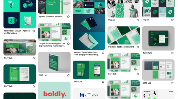 Source: Pinterest
Then how should we make a mood board? First, you need to find and collect designs for the mood board. You need to find the data and think about what elements to combine, such as photos, typography, and illustrations that match what you feel in your head. If you don't know how to place the elements you've collected, it's wise to use a mood board template. Try to move around to see what size and where each design element should be placed to best express the desired atmosphere.
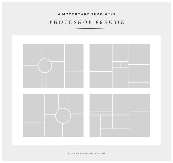 Source: Designyourway.net
There is no right answer to a good mood board. If the purpose of the mood board is clear and satisfactory, it is a good mood board. In addition, the following three criteria must be met:
- The most important factor must be noticed first. (Hierarchy Structure)
- There should be no elements that do not fit the atmosphere. (Unity)
- It should be possible to explain in one sentence. (Clarity)
It is most important to think about the purpose of the mood board, think about what to do to achieve the purpose you set, and find a way.
4. Color Scheme for Brand Color
Once you have a comprehensive mood for your design, it also needs to be visually consistent. Compared to other senses, sight is better at cognition and association, and the color is a representative nonverbal communication element that can share unique sentimental images. So it's one of the biggest factors that can deliver a unique brand experience. In the field of color theory and psychology, every color in the world affects us in terms of emotion, mental, and physical aspects. The research results below show the importance.
When asked about the importance of color when purchasing a product, 87.7% of the respondents answered that more than half of the product selection factors accounted for more than half.
Source: 2004 Seoul International Color Expo Secretariat
People make subconscious judgments about a person, environment, or product within 90 seconds, 62% to 90% based solely on color.
Source: CCICOLOR - Institute for Color Research
Color can increase brand awareness by up to 80%.
Source: University of Loyola, Maryland Research
All colors have both positive and negative meanings. So the meaning of the color itself is important, but how much color you use is also very important. No matter how good the meaning is, if you use it too much, people who are seeing them could have antipathy. Let's check the meaning of each color with the logo image of the global brands.
Red
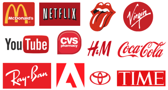 Source: MARION BLOG
- Positive Meanings: Warmth, Energetic, Excitement, Passion, Stamina
- Negative Meanings: Anger, Irritation, Fatigue, Intense Debate
Red is often used to convey the meaning of a warning. It's because it has an effect that looks closer than it is, so it attracts attention. However, if there is too much red around the surroundings, it can cause fatigue and put a burden on people, so it is recommended to use it adequately.
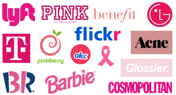
Pink
 Source: MARION BLOG
- Positive Meanings: Femininity, Romance, Nurture, Care, Warm Love
- Negative Meanings: Lack, Vulnerability, and Feeling Powerless
According to a study conducted in the United States, pink paint on the walls and ceilings of the cells in the prison reduced the aggression of the inmates. By using pink, you can deliver a soft, gentle, and calm feeling.
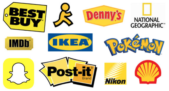
Yellow
 Source: MARION BLOG
- Positive Meanings: Happiness, Joy, Confidence, Positive, Optimistic
- Negative Meanings: Irritation, Anxiety, Impatience, Depression
In general, yellow is often used to convey a cheerful or active feeling.
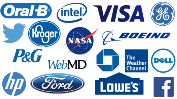
Blue
Source: MARION BLOG
- Positive Meanings: Logicality, Clarity, Reliability, Optimistic
- Negative Meanings: Coldness, Indifference, Callousness
This color is often used by brands related to knowledge-based businesses such as IT, science, and finance. With the blue logo, it looks clean and cool-headed.
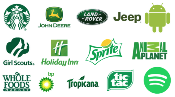
Green
 Source: MARION BLOG
- Positive Meanings: Stability, Peace, Health, Nature, Freshness
- Negative Meanings: Stagnation, Boredom
The green color is often used in food and nature-related brands. Bright green is used to convey freshness, and dark green is also used to convey wealth and fame.
The color scheme is a major area of design planning with projects to make effective use of the functionality of colors. Therefore, to find a color that matches the brand, we need to understand the message such as how the brand was created and the direction we pursue. Answer the questions below.
- Why was the brand made?
- What problem are you trying to solve?
- Why should customers choose our brand?
- How do you want your customers to remember your brand?
- What are the five keywords to introduce your brand?
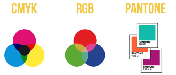
For the brand color scheme, it is recommended to use one or two auxiliary colors that can be used with the main color. When you decide on a brand color, you have to perceive that the way you create color is different depending on the online and offline. Online create color with a light, and the color used on computer monitors or smartphone screens is RGB, but when printing or printing offline, it is expressed in CMYK colors.
 Source: CEVAGRAF
RGB varies depending on the monitor and smartphone model, and CMYK can vary due to the type of ink used in the printing shop and it is also affected by the humidity and temperature of the printing day. Also, due to the difference between light and color, it is impossible to match RGB and CMYK the same. So Pantone color is used to make it as similar as possible online and offline. Pantone Color is a color palette made by Pantone in the U.S., and each color is numbered, so it's used as a standard for choosing colors in each field. When deciding the color of a brand, you have to keep in mind a variety of things besides the feeling of the color.
5. 2022 Color Trend
The color trend for 2022 will be minimal, calm, and soft colors rather than colorful and artificial colors of fluorescence. Global creative platform ‘Shutterstock’ analyzed millions of image downloads and pixel data to identify the three fastest-growing colors in demand and the most popular colors in 20 countries around the world.
Calming Coral
 Source:shutterstoc.com
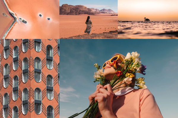
The first is Calming Coral (#E9967A). It is a more monotonous and toned-down peach color than the existing bright and vivid colors so it's perfect for expressing health and happiness. This color can be used to create a nostalgic design, especially in combination with Dusty yellow and pink, or in combination with contrasting sky-blue colors to create a natural and comfortable look.
Velvet Violet
 Source:shutterstoc.com
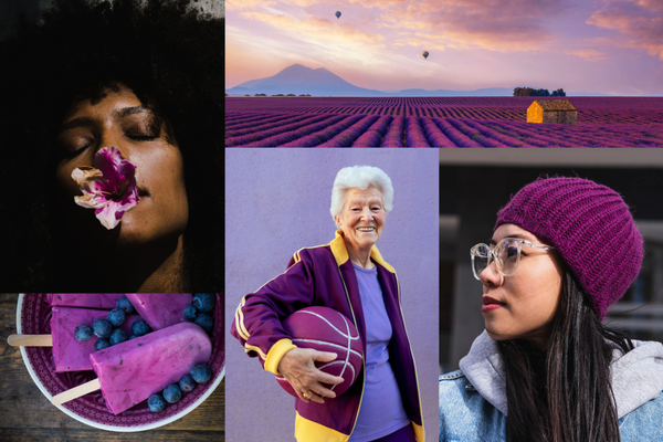
The second color is Velvet Violet (#800080). It's a pinkish purple color that feels luxurious and elegant, and it's the boldest among the 2022 trend colors. When used with contrasting green colors, such as emerald, it complements naturally. Considering that it belongs to the dark color in the color spectrum, the velvet violet finely supports colorful neon colors.
Pacific Pink
 Source:shutterstoc.com
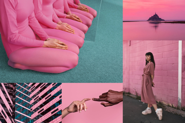
The third color to introduce is Pacific Pink (#DB7093), which is expected to be more subtle than hot pink in 2022. Pink cotton candy-like colors that are lively and calm are expected to become popular. It can create an attractive combination of colors when used with other pink or peach colors.
Green Colors
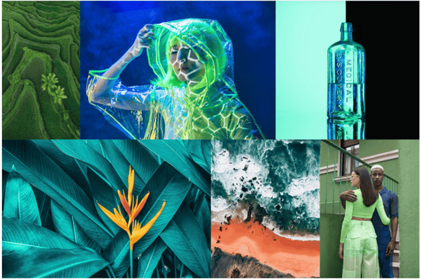 Source:shutterstoc.com
Flo Lau, the global creative director at Shutterstock, explained, ‘2022 trend colors show that people prefer more natural, simple, and calm colors.’ In addition, as a result of using Shutterstock AI, the color that leads to the highest click rate and conversion rate in the advertising campaign is predicted to be green.
Green is often used in content to bring up the image of a healthy lifestyle that encourages fresh food marketing or environmental preservation. The number of downloads of greenish natural scenery images increases every year, and mountain images taken in the air increase by 1,396% year on year. This data-based use of green for marketing projects is expected to improve campaign performance and increase click-through and conversion rates.
We are exposed to new brands every day while using social media. It's no exaggeration to say that all the information we get about the brand or product we use comes from branding. So you have to invest to make it a brand that stands out among so many brands. Branding enables you to gain brand trust from potential customers and show your brand's unique identity and value. In addition, you can further strengthen the link between the customer and the brand by arousing the customer’s sympathy.
To Become a Better Brand, Get Free Consultation Now